Time: September 2014 - August 2015
Team Size: 3, advised by Dr. Lindsay Reynolds and Dr. Geri Gay
Role: UX Researcher/Designer. My job was focused on design research, usability study, and user testing
Methodology: User Testing, User Interview, Storyboarding, High-Fidelity Prototyping, Affinity Diagram, Secondary Research, User Survey
Product: Academic paper submitted to ACM MobileCHI 2016 conference, interface prototype for Nutriphone mobile application
*Note: Study result is excluded because the paper is currently under review
Introduction
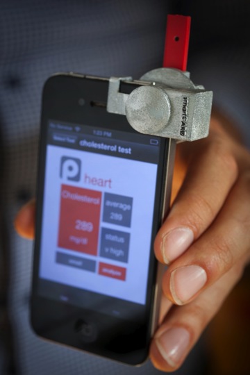
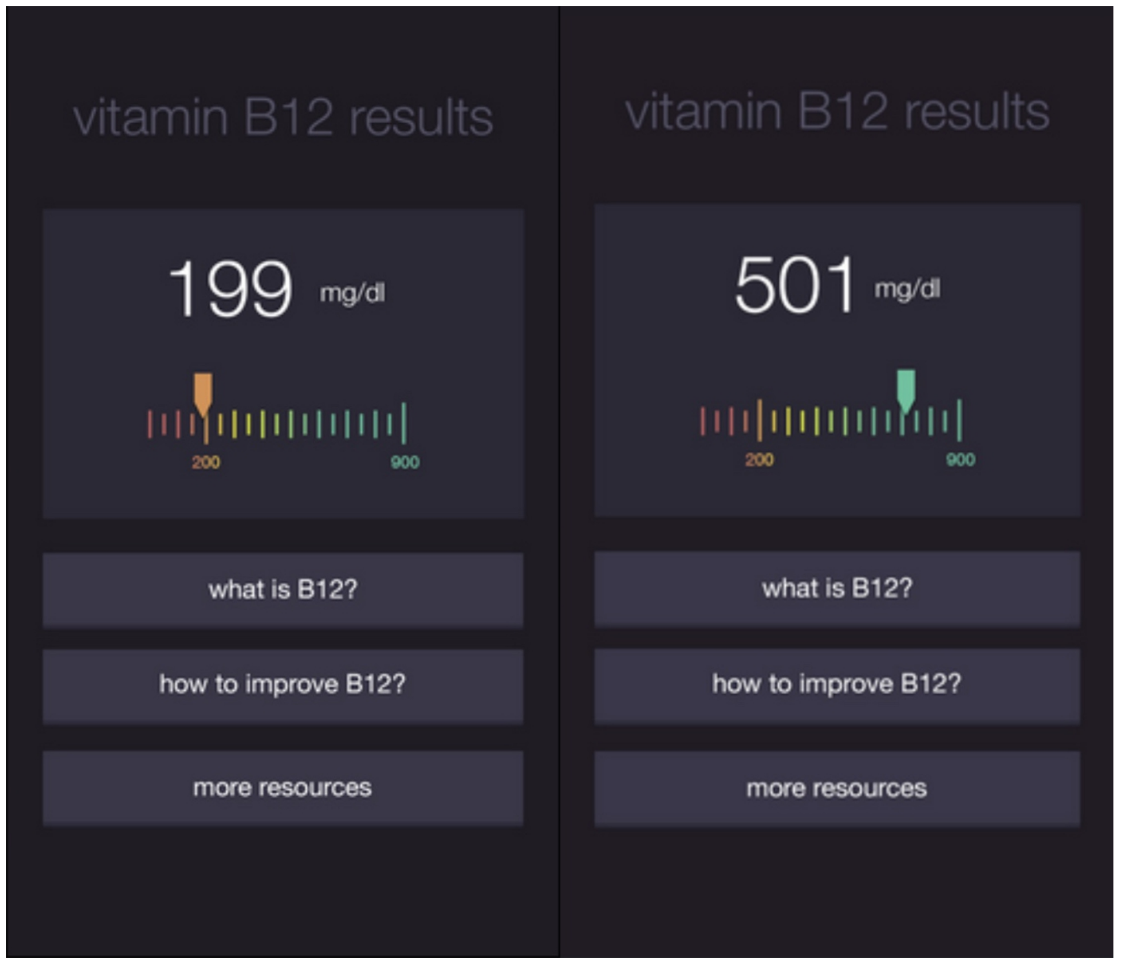
Nutriphone is a smartphone based micronutrient testing system that utilizes phone cameras to analyze blood results for Vitamin B12, D, cholesterol, and other health markers.
We are exploring how individuals interpret different representations of their health data, cultural factors impacting use of the system, and the ways in which values and trust affect use of the system.
This project is a collaboration between the Interaction Design Lab, Cornell Mechanical Engineering and Nutritional Sciences, researchers at the University of Maryland, and industrial partners.
Methodology & Procedure
User Research: Understanding Users
My role: User Researcher
At the beginning, my role was focused on understanding our potential users. The nutriphone application was at first designed for medical practitioners in developing countries, and the goal was to have a working prototype tested in India, summer 2015.
Because of the difficulty in recruiting users directly from developing countries, I recruited Cornell students who are either from or have experience (e.g. volunteer) in developing countries. For each participant recruited, I conducted an in-depth interview on their experience, local mobile technology usage, people’s attitudes/beliefs toward technology, culture taboos, and things related medical practices, etc.
In the meantime, I also conducted literature reviews, including interface design for different cultures, cultural psychology, and current mobile technology in developing countries.
My user research greatly helped my team gain the context we were designing for, as well as helped us clear our design direction.
Storyboard & User Task Flow
With the designer and developer, we individually created three storyboards based on our understanding of the users. We then got together to go through each storyboard to identify features we like, using Post-it notes. Our designer later took those storyboards to create the initial design.
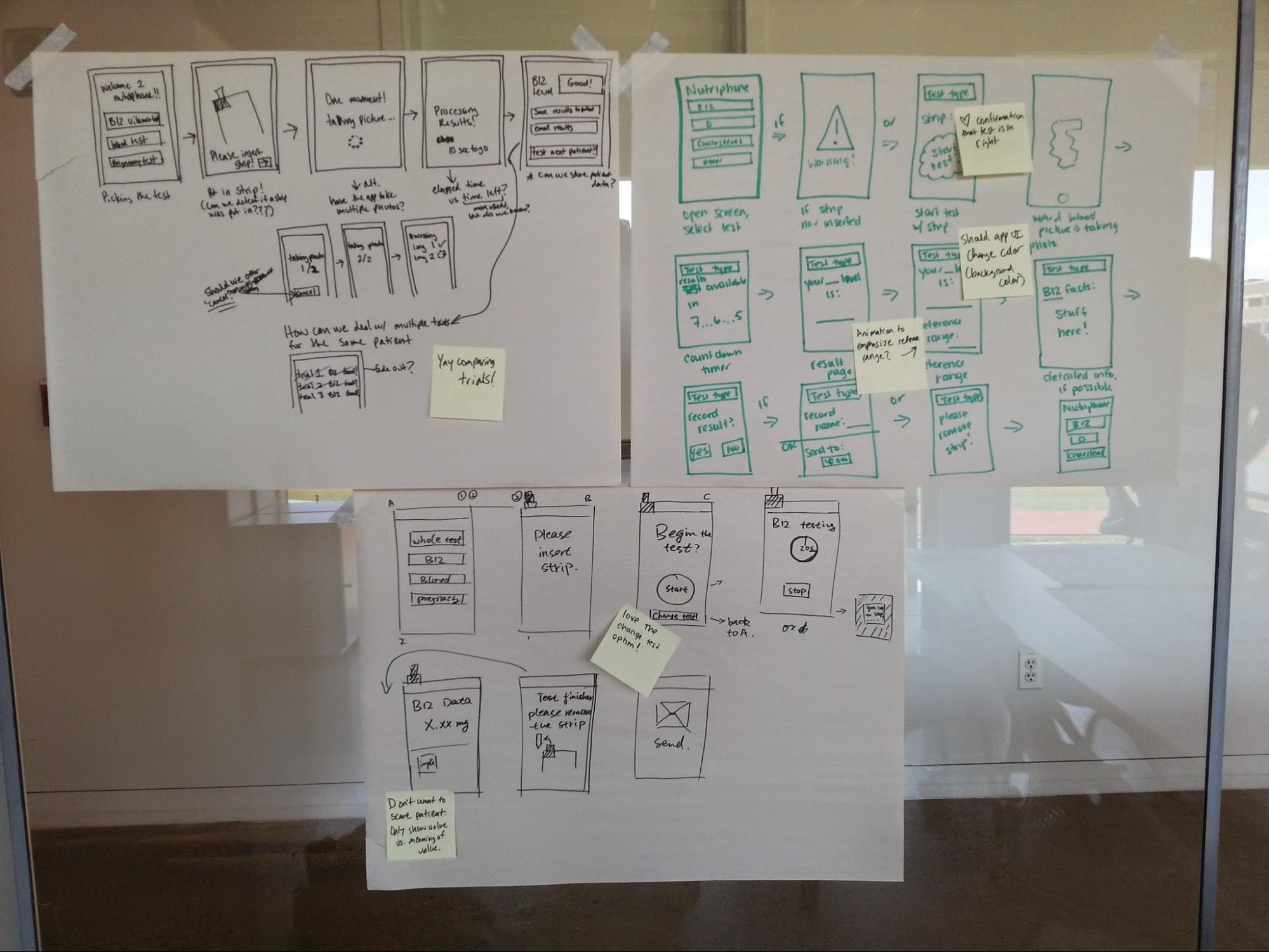
High-Fidelity User Interface Prototype
During the design part of the project, I mainly provided design research support for our designer, such as cultural factors on color scheme and workflow. I also provided feedback for our designer in our regular team meetings.
Design Evaluation
I am the team lead for this part of the project. With the prototypes our designer created, I recruited and conducted 27 in-lab user testing sessions. I also collaborated with our team in creating a survey for the online survey study. Please see study details below.
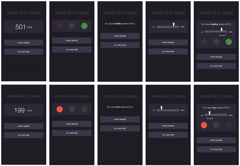
Online Survey - Comparing Interface Designs
Five variations of interface design (number, color, text, graph, hydrid) were tested using with 249 MTurkers (Amazon’s Mechanical Turk). Each participant completed an online questionnaire evaluating different result interface designs. Participants were asked to rank three designs they viewed in order of preference.
We used descriptive statistics and Fisher’s exact test for quantitative data analysis.
Lab Study - Interactive Prototype Debrief Interviews
I conducted user studies with participants, using an interactive prototype of the NutriPhone system (N=27). After the user studies, I also conducted semi-structured interviews.
Participants were first asked to use an interactive prototype of NutriPhone application on their personal smartphone. There are two conditions, in one condition, participants received the result page that displayed B12 levels within recommended range; in another condition, people in the other condition received B12 levels that are lower than the recommended range.
Following the user testing, I followed up with questions about how they understood (or did not understand) their test result, how they make sense of medical test results, their overall impressions, and their feedback on usability.
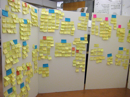
Data Analysis - Affinity Diagram
I was also one of the three researchers who was responsible for data analysis. We collaboratively conducted data analysis with the qualitative interview data collected.
- First, we transcribed all the interview recordings.
- Each of us went over each recording transcript to identify potential issues and problems, as well as intriguing quotes from participants. Every identified issue and problem were recorded on a separate Post-it note. After we examined every transcript, we collected all the Post-it notes together.
- At this point, we were ready to conduct a big affinity diagram analysis session. With the general trends we perceived from the problem identifying stage (Stage 2), we came up with several big categories, including Results Sensemaking, Doctors, Sources/Resources, and Personalization.
Based on these general categories, we began to arrange posters into clusters by posting on the wall. Through this step, we sorted ideas into natural themes by asking ourselves “what ideas are similar?” and “is this idea connected to any other ideas?”. In order to prevent influences from other researchers, the sorting process was done in silence. We kept moving post note until consensus was reached.
- This step and the next step were focused on consolidating three researchers’ ideas on each Post-it notes as well as each cluster. We first discussed how each note fit into each cluster.
- Then, we discussed each note cluster. Specifically, we discussed the meaning of each cluster, whether the categories we came up with earlier still stand, and newly formed themes. From this step, we finalized six themes: Results Sensemaking, NutriPhone App vs. Real Doctor, Sources/Resources, Trust, Personalization, Blood/Doctor Visits. Each theme contains three to eleven sub-themes.
This also was the last step in our three-hour long affinity analysis.