Time: December 2015 - January 2016
Team: Myself and Sam Tung (My best friend who gave me incredible technical support)
Tools: Paper & Pen, Sketch App, Photoshop, Illustrator; JavaScript (JQuery.js, D3.js), HTML5, CSS3, Bootstrap
Understanding Users
This website was built for job searching purposes. The primary purposes for people who come to my website:
- Check out what I have done (Portfolio)
- Get an idea/impression of who I am
- Use this site as a port for more resources (e.g. Resume and LinkedIn)
- Just get curious and interested
Design Concepts & Elements
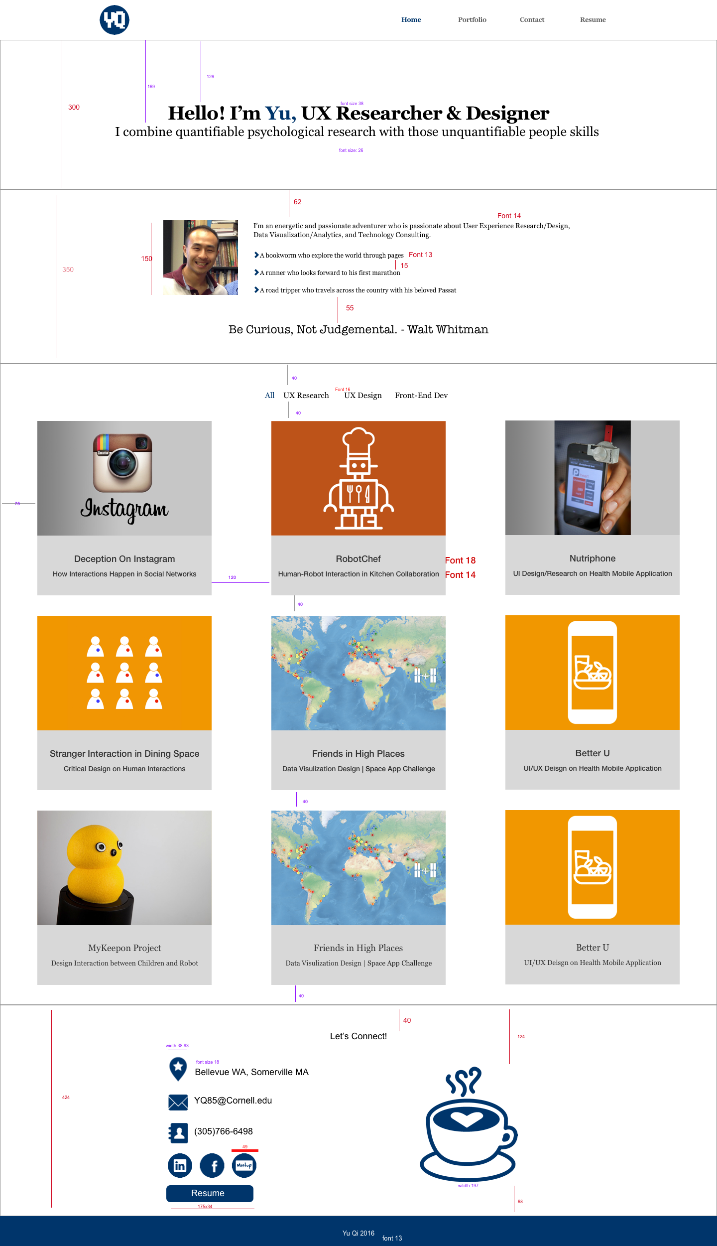
I used minimalist web design principles to design this website. I want my users to get to the point and find what they need right away without much distractions. So I reduced the elements of my website to the ones that are truly needed, so users can interact with less clicks:
About me: I originally envisioned this section to be a separate page, but then I realized people may be interested in my portfolio more. The current design is a small section on the homepage that gives users a quick idea of who I am without distracting them too much. The design of this section was inspired by Tingting Wu's portfolio.
Portfolio:
- This is the most important section of the whole website. As most people are directed to this website mainly to view this section. So it's in a very prominent location on the homepage.
- My projects can be easily categorized into UX Research, UX Design, and Front-End Development. By providing a filter functionality, it's much easier for users to find projects in different categories.
- Rather than using modal windows to display details of each project, I decided to direct users to a separate page for full details. Yes, this may require my users to go to another page and then come back to see other projects, but this allows me to present a full picture of each project. Also, with a clear site structure, this design is not going to get my users lost.
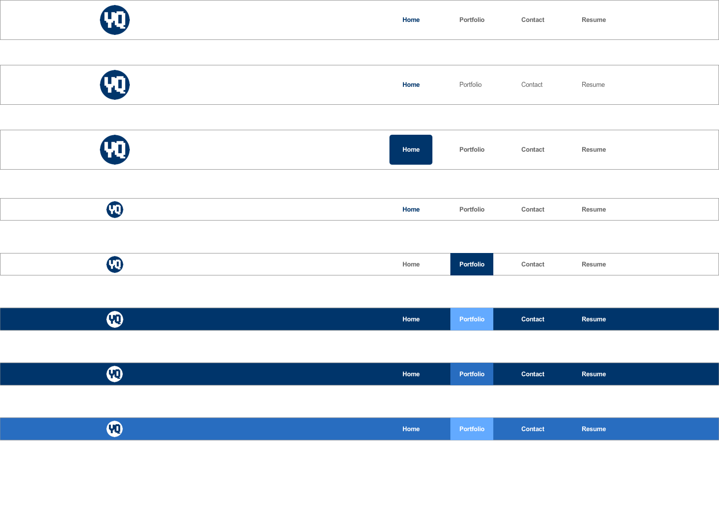
- Because I lead my users to a separate page for each project, I assumed my users need to get back to the homepage and check other projects. Therefore, other than the main navigation on the top of each project, I put a breadcrumb navigation on each page to give my users a clear idea of the site hierarchy and where they are.
Contact: A necessary section for every personal website. I left my contact information with social networks. I didn't use forms, because my personal experience is that most submitted online forms will end up in black holes.
Resume: After seeing many online portfolios, I found that linking resume to a pdf file is a more conventional design. It's easy for people to download or print. So, for this section, I believe following the convention is a good choice.
Design Process
I. Paper sketches
II. Sketch Application:
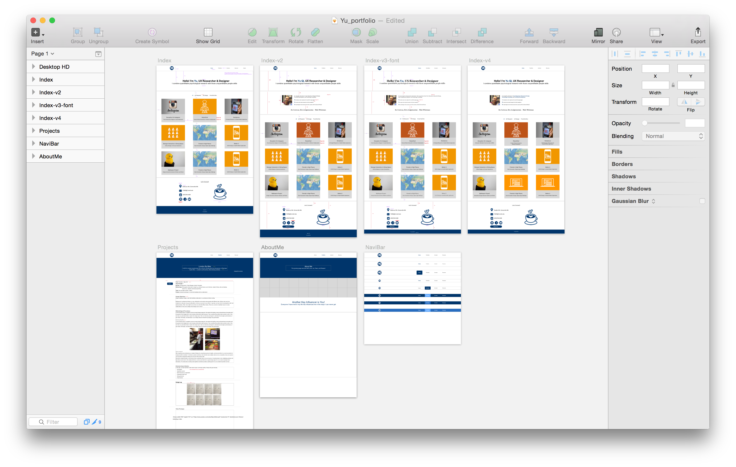
Updates - Google Analytics
Purely out of curiosity, I incorporated Google Analytics for my website. It is lots of fun to get to know what kinds of users are visiting my website. I added a couple of images below. It seems like if you are browsing this page right now, you are most likely:
- In the United States
- Using Macintosh systems
- On a computer
- Using Chrome broswer
- A new visitor [ThumbsUp!]
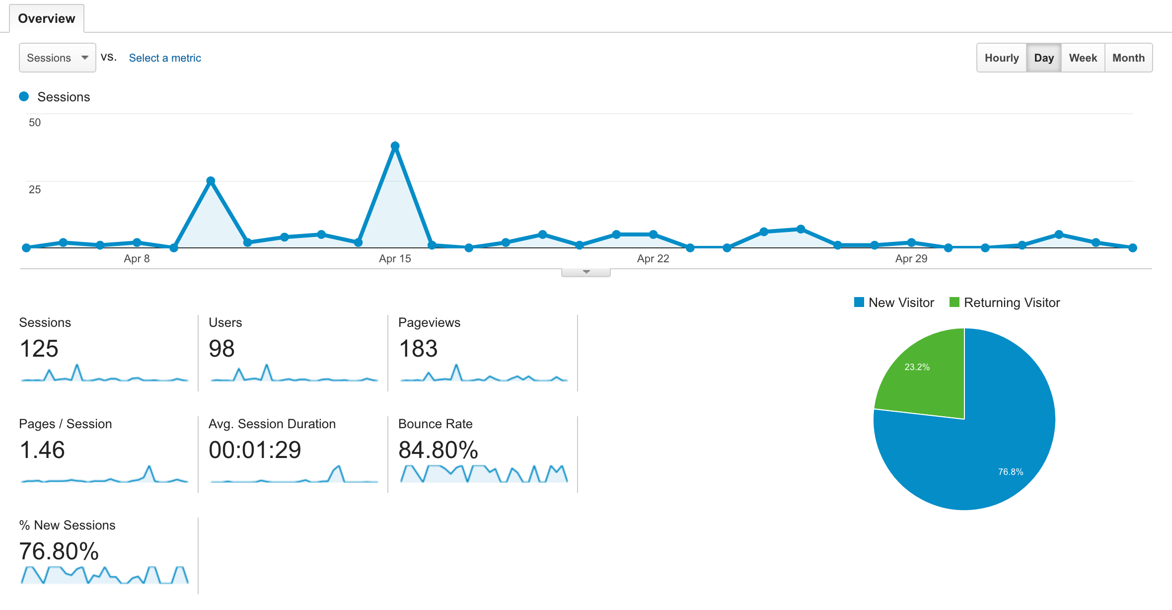
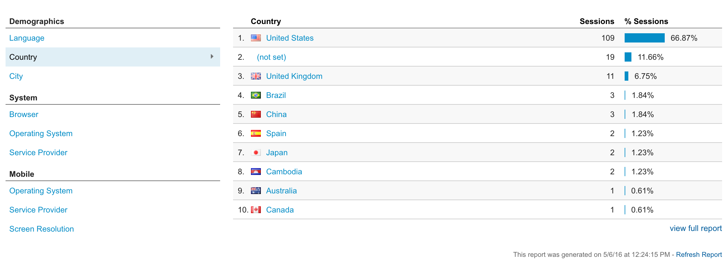
Note: Google Analytics is a powerful service, and one question I have is that some of this data is probably generated by myself, as I need to constantly check if my portfolio is updated. How can I identify and separate my data from everyone else’s? Please let me know if you get an idea.
Special Thanks!
Special thanks to my friends Sam Tung, Lauren Tonge, Geoffrey Goh, Saumya Bhatt, Cynthia Todd, and all other friends who gave me incredible technical, design, and writting support.
This website wouldn't be done without their help. :)