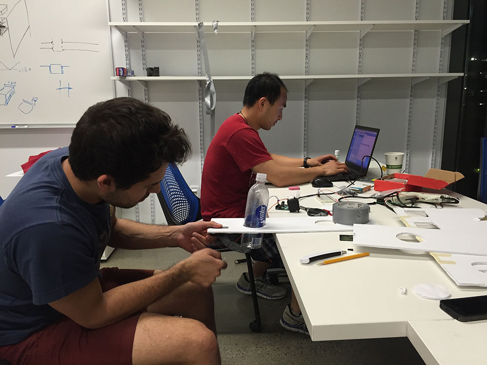
Time: February – May 2015
Team Size: 5, advised by Dr. Malte Jung
Role: UX Researcher, Project Manager, Arduino Developer
Methodology: Ethnographic observation, design log, contextual inquiry, user interviews, design thinking, video prototyping, wizard of oz, object-oriented programming
Tools: Pen & paper, Arduino, iMovie
Product: A physical prototype of a robot that facilitates kitchen collaboration
Design Objectives
Design challenge: Design a robot that facilitates collaboration in a professional kitchen setting.
Background: A professional kitchen is a very collaborative environment among people with different roles. Kitchens may vary from restaurant to restaurant, but good collaboration is the key to success for any kitchen. Often, there might be more than one chef with different duties. What can a robot do to facilitate human to human collaborations? How can we design and prototype such a robot?
Methodology & Procedures
For this design project, I applied a human-centered design approach. I started with building a deep understanding and empathy with the people we designed for, which included all the kitchen staff members. Then I defined the problem that we wanted to solve. In the next step, we generated ideas to explore the design space. Next, I and the rest of the team members built early video prototypes to understand the strengths and limitations of each of the ideas.
Building Empathy
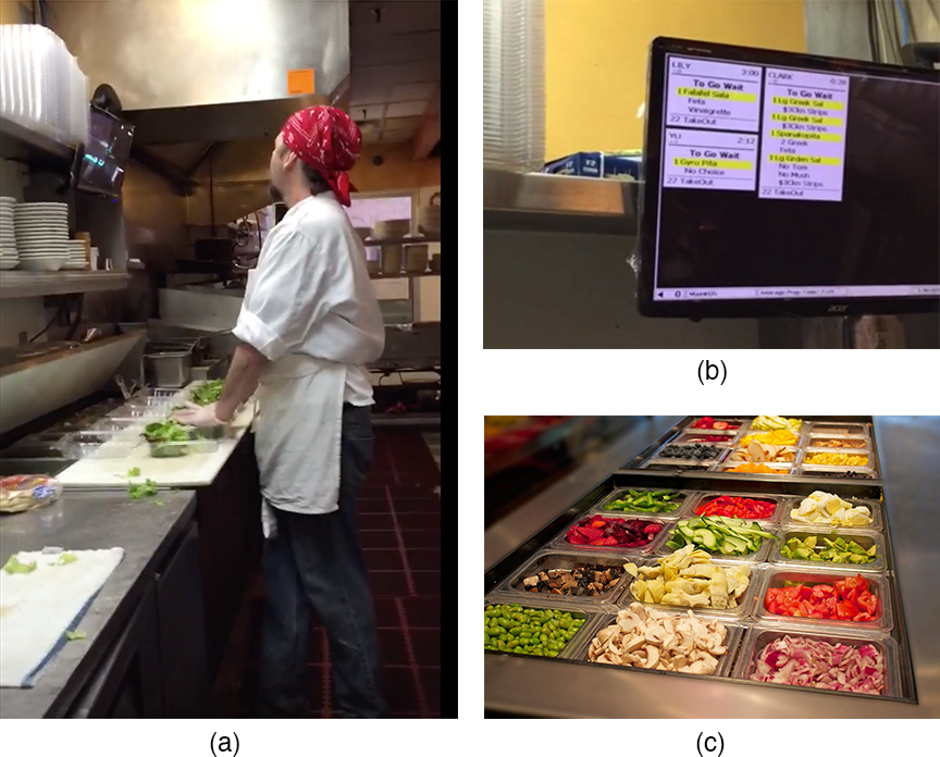
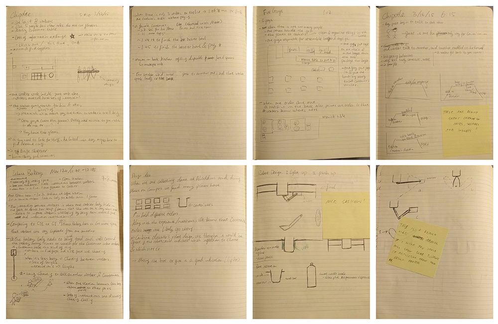
In order to build a deep empathy and understanding of our users, our team went to eight local restaurants to observe ongoing kitchen activities. This selection of kitchens covers different cuisines, open or closed kitchen types, fast food or sit-down restaurant types, and on-campus or off-campus. With permission, I conducted contextual inquiries for two restaurants. Those highly detailed observations allow us to define our focus without pre-assumptions and design what they really need.
Also by observing different kinds of restaurants, we discovered that ingredient containers (figure below) are widely used across a variety of restaurants like fast food and Chinese. I will discuss the significance of this observation in the following sections.
Define Problem
After unpacking and synthesizing our empathy findings into compelling needs and insights, we discovered that it is a common practice for restaurant staff to multitask. To minimize customer wait times, the chef often does multiple orders at once; meanwhile, there are in-person communications happening between the chef and other kitchen staff.
During the contextual inquiry, a chef told us that a customized order is very error-prone. Connecting back to the multitasking practices and high-stress environment in the restaurant kitchen, we discovered that this is a great design space for us to create meaningful robot interactions.
Brainstorming & Ideation
In this step, our team explored a wide solution space, and large quantity of ideas with good diversity.
We took a wide-to-narrow ideation process. With the agreement of creating ideas as wild as we can, each team member brought self-generated ideas to the collaborative brainstorming session. During the brainstorming session, each of us explained own ideas, and we also briefly analyzed the pros and cons of each idea. Once the consensus was reached that we were going to focus our innovation power on food ingredient container, we started collaboratively brainstorming on different possibilities. With whole team’s effort, we decided to explore further on three possibilities of food container.
Three ideas are push-up, lift-up, and light-up. Through rapid prototyping on these three ideas, we realized that the pushing container up idea was more practical, reliable, and applicable for real-life situations, which was used for the final prototype (details are in the section “physical prototype” below).
A collection of ideas that we generated:
- Light signals
- Ingredient scanner
- Robot that picks up ingredients
- Preparation table robot
- Allergy detector
- Task allocator
Design Log
Prototyping
Video Prototype
Physical Prototype
The first prototype is to push ingredient containers up to in order to signal which ingredients are needed.
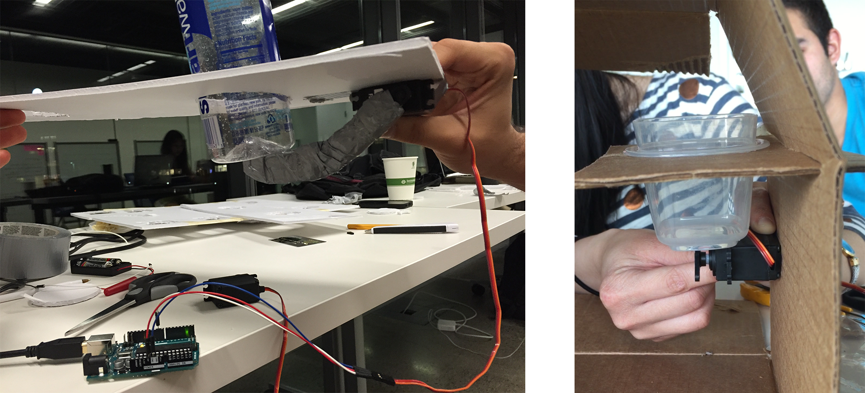
The second prototype is to have a structure that can help us lift the lid of ingredient containers.
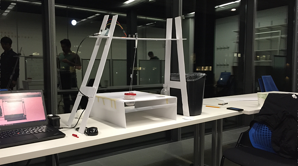
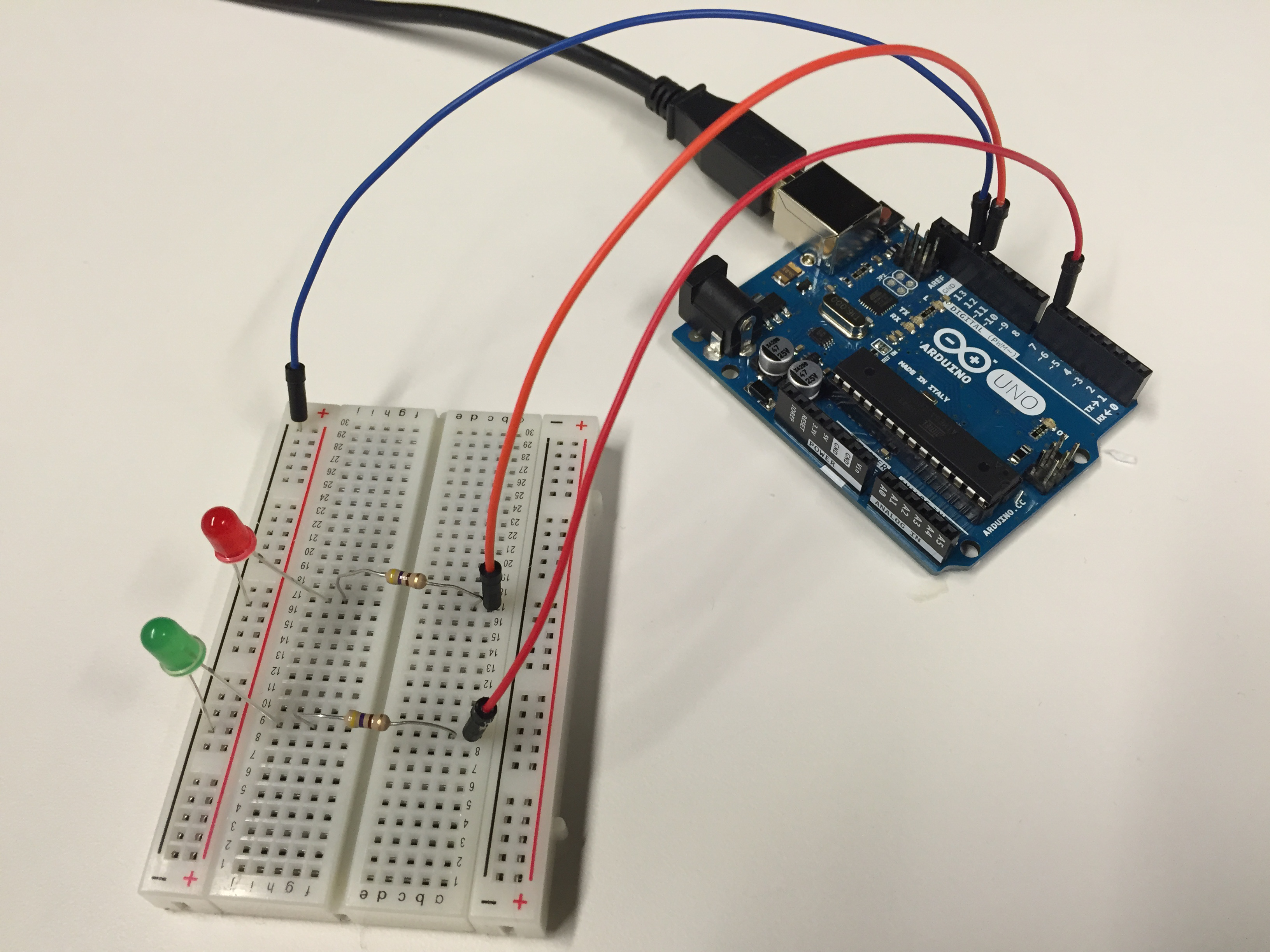
The third prototype is to light up the container box.
Final Design
After video prototyping and initial physical prototyping, we decided to pursue and further iterate the push-up idea. The rationals are below:
- Compared to other design ideas we have, the push-up idea gave us greater freedom to design interactions, such as signaling behavior (pushing up), reminding behavior (shaking), and warning behaviors.
- Through our video prototype, the push-up idea is more subtle, intuitive and natural compared to other interactions.
- Most ingredient containers we observed are made from metal, which makes the light-up design hard to implement and less practical
Evaluation
Things I Learned
The significance of our observations - At the beginning of this project, we did not have a clue what would be the best item to design. It was truly through the in-depth observation and repeatedly watching recorded observations, we discovered meaningful design opportunities. It is a valuable process for discovering user needs and developing empathy, both on developing new products and refining existing user experiences. Design is really in the everyday life.
